UI UX Design / Contributor Website
Global Voices
About the Project
Global Voices is a border-less, largely volunteer community of more than 1400 writers, bloggers, citizen journalists, analysts, online media experts and translators. GV works in 167 countries and in more than 35 languages, to find the stories coming from marginalized and misrepresented communities and speak out against online censorship and support new ways for people to gain access to the internet.
Agency
Client - Global Voices
Country - International
Role
Website, UI design, Content Strategy Workshop
An interface lift for citizen journalism
After many years of an ever-expanding organization, technology and web standards rapidly outpaced budgets. The Global Voices website had indeed reached its moment to make a leap forward. The size of the organization, contributors and content was constantly growing. To raise the perceptions, persona and legitimacy of the organization, an improved user experience, refreshed UI and better usability was needed for getting the site working on newer, smaller devices. Additionally, Global Voices was ready to change course to become more sustainable and competitive in the online news world. For years wearing a blogger’s uniform, GV was ready for a wardrobe change to be taken more seriously as a real news source of citizen journalism.

Workshopping Consensus
As with any design process, it’s about navigating limitations. But first, we needed to dig into the internal practices of 1400+ contributors to also understand better how the publishers needed the site to operate. In working closely with the core team, we also soon faced a new challenge of making broad changes that would require “buy-in” from the broader team. GV is more of a community structure and the website is the face (and heart) of the organization. As a result we organized a workshop with the broader team of contributors was needed to voice concerns, outline objectives and align on a path forward that could work for everyone.

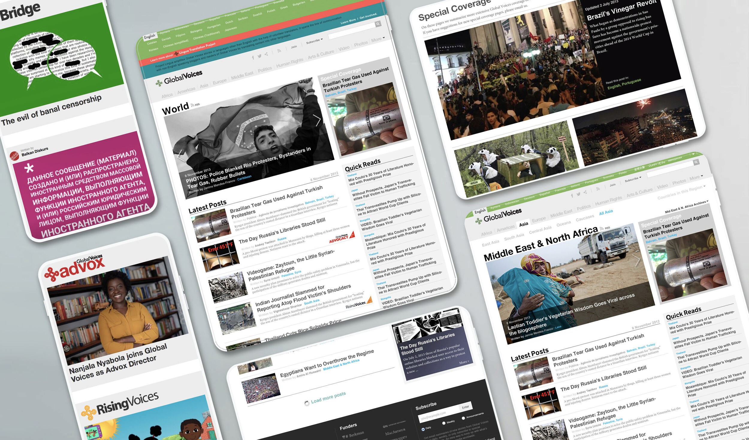
Multiregional, Multilingual, Multi-Topic..oh my!
As with any design process, it’s about navigating limitations. But first, we needed to dig into the internal practices of 1400+ contributors to also understand better how the publishers needed the site to operate. In working closely with the core team, we also soon faced a new challenge of making broad changes that would require “buy-in” from the broader team. GV is more of a community structure and the website is the face (and heart) of the organization. As a result we organized a workshop with the broader team of contributors was needed to voice concerns, outline objectives and align on a path forward that could work for everyone. Workshop: Apart from the design challenges of designing any large site, we had work around the limitations of a database with a less than ideal structure.What was needed was to re-architect the information and content strategy altogether to make navigating multiple menu/filtering layers of 1400+ contributors, 167 countries, and 50+ languages a more accessible experience. But in the end, we needed a design solution that could achieve better usability of how users can filter, search and sort such a large mass of content. Working within contraints: So definitely one of the biggest problems to solve was the many layers of complex and lengthy navigation that would simply leave most users running for the emergency exits. One major fix was adapting the language selection options into a compact, collapsible menu (which is actually its own separate page and micro site; GVLingua). Additionally a way to integrate what was once the system to filter region + topic into a smarter, more intuitive top level navigation.
Menu Structure Before
Menu After

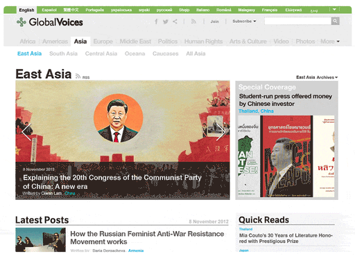
Outcome: Restructured interface for contributors + responsive design for users
After moderating an intensive two day workshop, we were able to hear voices, collect feedback, make compromises, and ultimately find a consensus. This got the partners more buy-in from the team, led the way for for optimizing a friendlier user experience that works on more devices, a more professional interface and would be more easily adaptable as the site continues to grow. This led to better team practices, standardizing how contributors could edit, upload and interact with the articles and its many categories. And of course, a cleaner + friendlier user interface for navigating and customizing the site, language and region relevant for any user. Instead of a functional blog, we could elevate the perception of GV as more professional interface and legitimate news site.


hello@pyko.net | US: +1.678.666.0099 | DE: +49.1634693379
©2024
hello@pyko.net
US: +1.678.666.0099
DE: +49.1634693379
©2024
hello@pyko.net | US: +1.678.666.0099 | DE: +49.1634693379
©2024